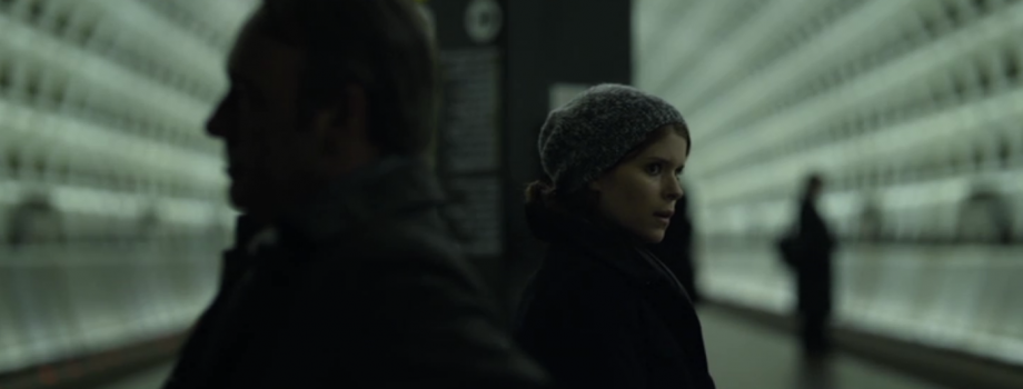
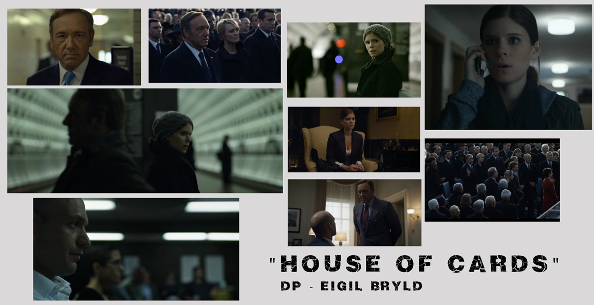
David Fincher‘s wonderful House of Cards is very dark. Dark in content, dark in tone and especially dark in visual aesthetics. Characters are shrouded in low light levels even in direct sunlight. It’s ominous, dread inducing and spectacular. It also bucks the trend of high contrast, blue/teal blockbuster looks that have been almost unavoidable in Films and TV for the last 10 years.
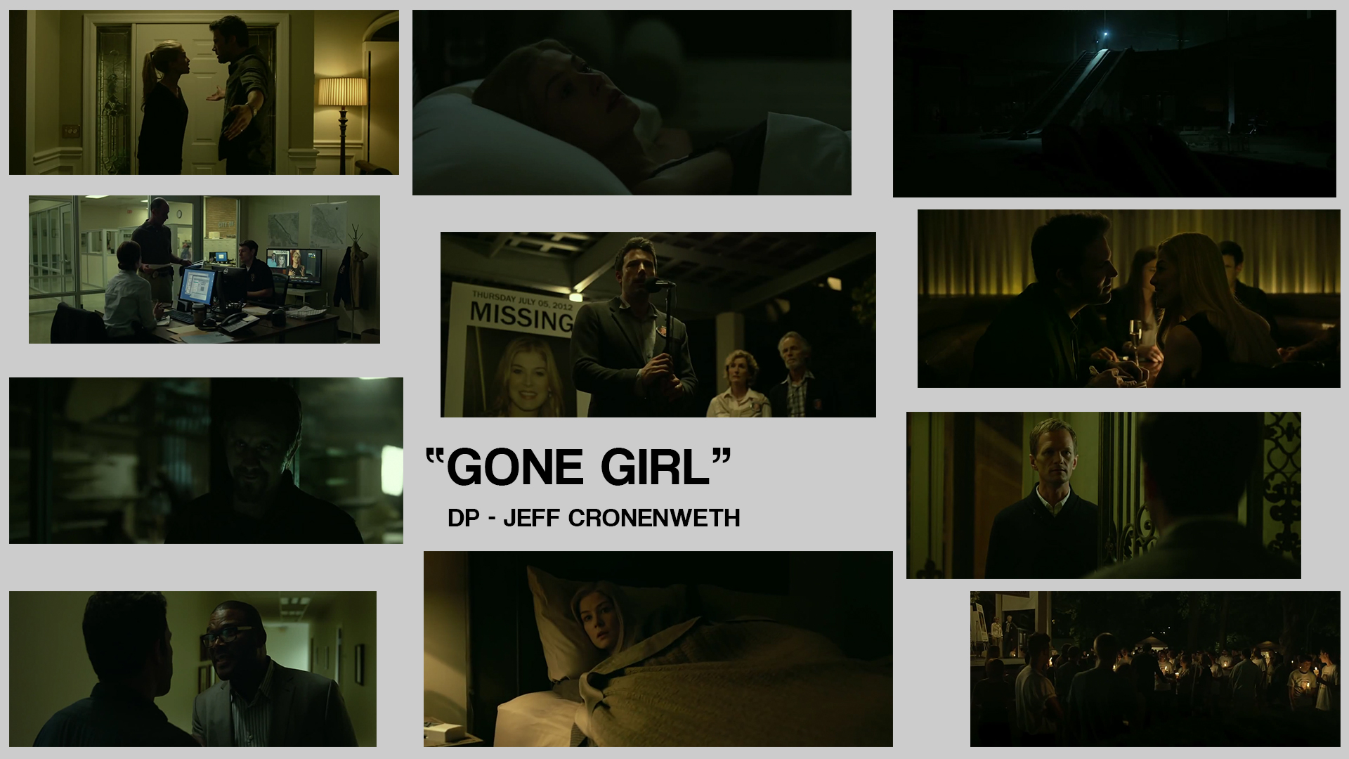
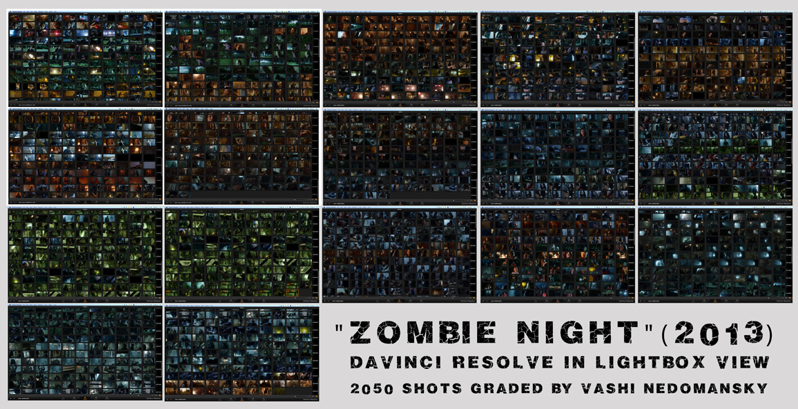
I recently completed a color grade on Zombie Night, a feature film starring Darryl Hannah and Anthony Michael Hall in which I applied a similar look that emphasized a darker feel with reduced highlights and color casts to set the tone. Here are some examples from Mr. Fincher’s last 3 films that showcase this look…and a color palette board from the film I just graded.
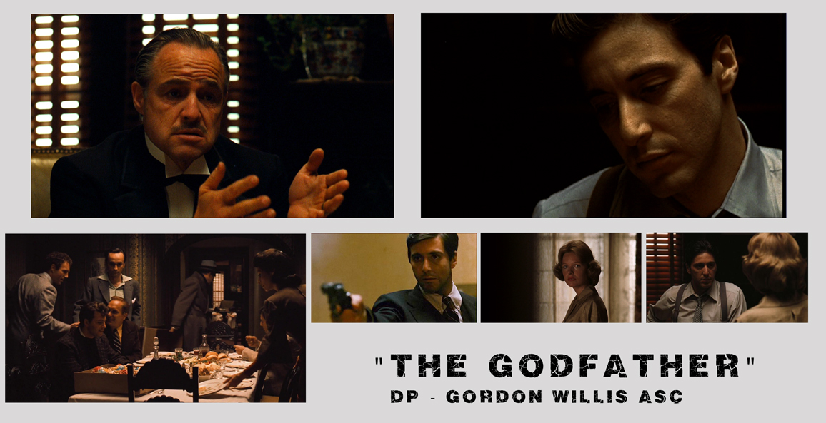
“The Godfather” is commonly referenced as one of the first films to break from conventional cinematography and “go dark”. Gordon Willis ASC was named “The Prince of Darkness” for his conscious decision to use low light levels and soft overhead lighting. He went as far as opting for not having the reflection of lights in the eyes of the actors. The studios were not happy, director Francis Ford Coppola was worried…but the resulting cinematography and impact of the film speaks for itself. The tone and dramatic weight of the epic story were aided and elevated by the Mr. Willis’ breathtaking work.
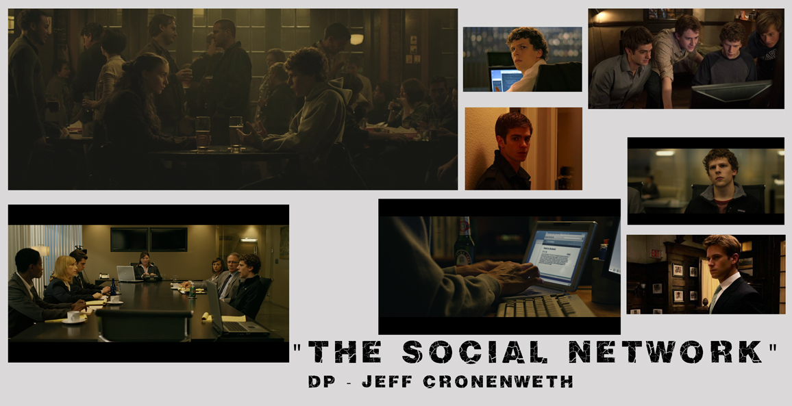
David Fincher is well known for his striking visual style and the immersive worlds he creates. I’ve been lucky enough to work in his offices and speak with Academy Award winning editors Angus Wall and Kirk Baxter who cut The Social Network and The Girl With The Dragon Tattoo. Their attention to detail and level of absolute perfection is second to none. Nothing that ends up on the screen is accidental or arbitrary…every frame is dissected and decided upon. In my view…Fincher’s visuals have leaned towards a more natural, realistic yet absolutely visceral feel over his last 3 projects. Let’s take a peek at what that entails…
From the first scene in a bar…a new aesthetic was displayed in The Social Network. It’s dark…but not with crushed blacks. As a viewer, there is a difference between crushed blacks and compressed dynamics of light. There is clear detail in the shadows but the highlights are lowered and colored. If 100% is pure white light…many of the whites in Fincher’s last 3 projects are at 90% (roughly) which constricts the perceived latitude of the image. These whites are also tinted towards the overall color of the scene. Orange is infused into both day and night scenes in The Social Network. Often blue is the go to night-time color but not so in The Social Network. There are no rules…it’s what feels right and I found it extremely effective here.
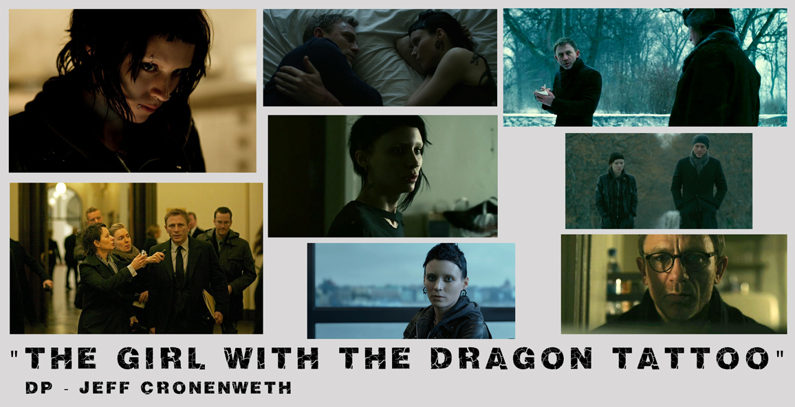
The Girl With The Dragon Tattoo
The Girl With The Dragon Tattoo display a continuation of this visual palette. In the winter setting of ambiguous sunlight and endless night…Fincher again compresses the whites and keeps clean and legible blacks. Even though so much occurs at night…the viewer never struggles to see what is occurring or gets lost in the visuals. From glass-lined offices to night-time exterior excursions…everything is pristine and clearly visible even when the light levels are extremely low. This can attributed to the ample latitude of the RED camera, the careful cinematography of Jeff Cronenweth and the color grade itself. The tinting of both orange and blue to entire scenes further blends the color palette of scenes and delivers a very hyper-real look. It’s set in the real world but pushes the boundaries to enhance the drama of the story.
A new low is reached in House of Cards. Scenes play out in extreme darkness. At the inauguration of the President…the scene is played out during the day but it feels and looks like midnight. The sunlight is white but it is so muted and desaturated that it seems like it is only there as a courtesy to illuminate the scene. The mids and blacks blend into each other to the point that the whole scene feels black and white. Kevin Spacey’s character is framed dead center and looks to the camera during the shot…he includes the viewer into his world and speaks directly to the camera. It’s eerie, creepy and supremely effective. I saw the raw RED footage at Fincher’s post production offices and all of it was perfectly exposed and dare I say…bright. I can see that the final images were all a creative decision to push the limits and deliver the images that he saw in his head.
During other daylight scenes, the same approach is applied. It’s never blinding sunshine…only the impression that it is daytime. To further imply the constricting and murky world of Washington politics…night-time scenes often allow just enough information to barely make out the characters. We strain to see the emotions and thought process of the actors as they are blanketed by low light levels and no fill lights to make them pop. This is a new kind of realism in cinematography where conventional lighting is thrown out and the onus is on us to extract what we need from what little we can see. It’s enough…but barely. It makes the audience work and pay attention to keep up with the story. Visual darkness represents and defines the cutthroat morality of the series. I personally love it. Some don’t. To each their own.
Most recently, GONE GIRL (2014) continues and expands upon the darkness and shrouds the characters within world of buried secrets and impenetrable blackness. Make no mistake…the visual depiction is not murky or muddy…it is a dismal, colorful bleakness that infuses and envelops the film. It matches the tone of the tale.
My take-away from watching the last 4 projects by David Fincher is that he’s utilizing quickly evolving technologies (RED, color correction, LED lighting) to redefine the visual boundaries of what is the minimum needed to represent and tell the story. It’s bold and radically different from let’s say…an episode of CSI or Transformers. It’s reality enhanced and a new take on what is considered natural light filmmaking. Then in post production/color grading, the midtones and highlights are lowered to bring down the overall brightness BUT most importantly…the blacks are never crushed so that the shadow detail is always retained. The final image is “Dark Clarity” and matches the mood and tone of his last 3 projects.
Finally…here are all 2050 color graded shots from the film Zombie Night which is scheduled to come out Halloween 2013. I chose to embody many of the principles and sensibilities that David Fincher used on my grade of the film. I will follow up with a more detailed examination and explanation of my post production process once the film comes out and I’m allowed to share all my assets and workflow. Zombie Night was shot on RED and I had 9 days to grade the entire feature on Davinci Resolve in my home studio. I was given three 4TB drives and colored at 1/2 resolution to get real-time playback. A lot of coffee and vodka made the whirlwind 9 days fly by. I exported to ProRes HQ and kicked out a XML for the final online.
Thank you for hanging on to the end and letting me ramble about only one of the aspects that contribute to the making of an effective film. I’ve been watching the choices in David Fincher’s last 3 projects and thought it worthy to discuss in the way that I see it and its relevance in the current state of cinematography and storytelling. Let me know your thought below!
Until next time…

There are 16 comments
I really enjoyed House Of Cards. It haa a wonderful look, and also a great costume design. As the other Fincher outings, all in it is very consistent.
Look forward for the Zonbie Night workflow. By the way in that section you mention that you were given “three 4 GB drives”. Should it be TBs?
Thanks for the comment Martin. I agree…House of Cards is firing on all cylinders. You’re right about the GB/TB! Nice catch…will go update it now.
This is a wonderful breakdown. Living in Baltimore, having seen many real locations now onscreen, I’ve been fascinated with all things House of Cards & Social Network. You were spot on in illustrating how color can be such an emotive thing. Can’t wait to see how this influenced your grading.
Thank you for the kind words Brian. I’m glad you enjoyed the post. Color and grading has such an impact on the story and the feel of a film/show. Once the producers clear the footage…I will be able to share stills and video from Zombie Nights and I will also be doing a breakdown of the entre color workflow with the RED footage and Davinci Resolve. Stay tuned!…
No problem man, you’ve really built out a great blog / site. Can’t wait to hear the resolve / premiere workflow once the producers clear the footage.
I’m still working w/ DSLR’s but can’t wait to make the jump to RED’s and C300’s
Very interesting seeing his visual style evolve, and be adapted to the best technology to tell the story and represent the characters “inner” thoughts thought visuals. Interesting seeing all the shots from ur latest grade, neat to see how the whole picture has some “color continuity” even using very small clips
Forgot to mention, Id love to hear more about your edit and grading workflow for Zombie Night.
Thanks again Jason for the support! I will doing an entire post on the grading workflow as soon as I get clearance from the producers. I will be able to go in-depth and show full stills and videos of how I work. Coming soon!
Excellent! Cant wait for the more info on it , more details the better. I’m like a sponge for this CC \ grading knowledge, great complement to my evolving editing skills . Feels like I discovered the lost magic lamp! So much
I love this low level lighting look and it would be great if you did a tutorial on this color grading. I have a basic idea of how to do it but would like to see how you would do it. Also I read the low budget action cutting post you did and i cant wait to test that out especially cutting 2 frames before impact and Ill shoot at 22 fps. Looking forward to your other posts.
Thank you Hazem. I will have some specific color grading posts coming soon addressing this style.
Stand by!
Thank you for this great article. You made some very good and clear observations. Truly interesting and inspiring! Thanks again my friend!
Thank you for the kind words Charles. More to come like this soon!
Hey Vashi…I love how you compiled the all the clips for zombie night…how do you do that? I think it would help on any project to get an overall sense of where the color palette is at any given time…thanks in advance
Thanks Wes! I just made screencaps of the Davinci Resolve project in Lightbox mode and compiled them in Photoshop. Hope that helps!
Awesome revisit to the article for Gone Girl! Its really opening my eyes for dropping gamma and highlights w/o crushing them for style. Thanks as always for the well organized info, Vashi!