DARK CINEMATOGRAPHY
The “dark” cinematography of several high-end productions over the last several years has been a widely discussed topic amongst filmmakers and fans alike. One thing I know for sure is that the creators are striving for an immersive and cinematic experience that helps them tell the best story possible. No one is trying to make any shot hard to see or disorientating. The final imagery is a creative choice approved by the DP, colorist, director and producers before it goes out into the world.
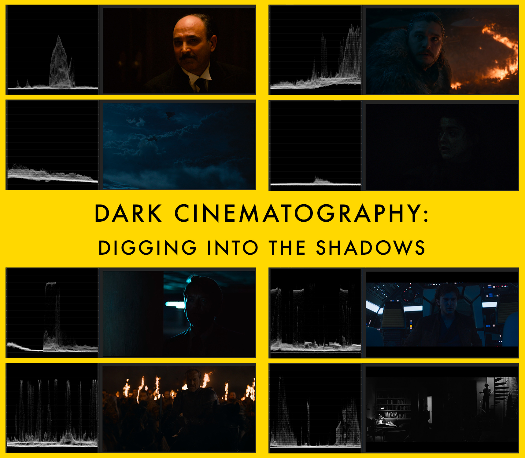
Game of Thrones (The Long Night) and Solo: A Star Wars Story are two recent examples that have raised questions with the color grades and their creative intent. People have said the imagery is too dark and the action hard to follow. I have color-graded 9 feature films and would like to share my thoughts on this topic. Below, I will present some examples from these projects and compare them to other films also considered to have “dark” cinematography. But first, some technical specifications to consider.
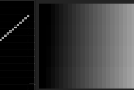
Before a master video file is delivered for broadcast / streaming / physical media creation, it is color graded and quality controlled. To quantify the video signal so we can judge luminance values during a color grade, we often use IRE (Institute of Radio Engineers). An IRE is a unit used to measure video signals. In the most simple terms, 0 IRE is black. 100 IRE is white. All other luminance values fall in between. Here is what a grayscale chart looks like on a Waveform Scope that measures IRE:
Black (0 IRE) is on the bottom of the scope and White (100 IRE) is at the top end of the scope. A general (!) guideline is that human faces should have an IRE of between 40 to 70 during properly exposed shots. Night time shots and other moodier creative choices can result in lower IREs but there needs to be enough data / information for the image to be legible.
The issue of how the final visuals are viewed is further complicated by several factors including: viewing device, streaming bit rates, compression, ambient room light and TV calibrations. If any single variable is not optimal, low light level scenes can be affected to the point of becoming murky, macro-blocked mayhem. Using the highest quality digital files available, I put the waveform scope on the left and the corresponding frame grab on the right Here are my findings:
THE DARK PRESENT
Game of Thrones – The Long Night (2019)
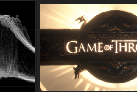
The title card shows a full range of luminosity / brightness with values hitting both 0 and 100 IRE. This implies the video file is an accurate representation and properly mastered.
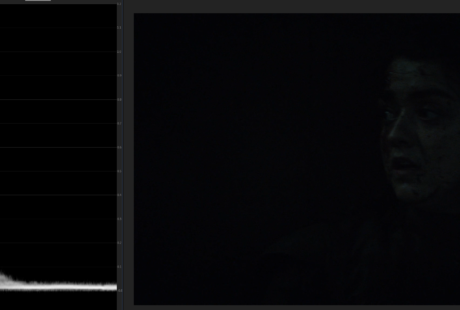
Game of Thrones – The Long Night #1 (2019)
This close up of Arya shows the brightest part of her face at only 15 IRE.
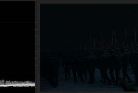
Game of Thrones – The Long Night #2 (2019)
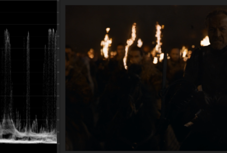
The marching troops hits a maximum of 15 IRE.
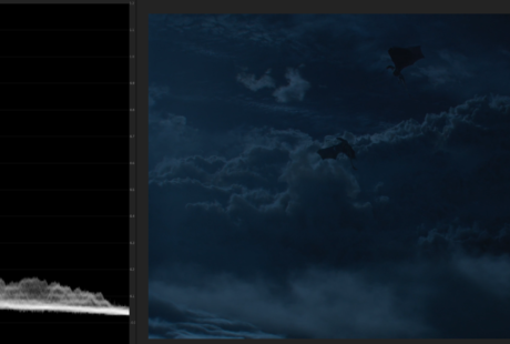
Game of Thrones – The Long Night #3 (2019)
The Dragon sky fight in this shot peaks at 30 IRE.
Obviously not every shot in this episode is excessively dark and flat in their composition and color grade.
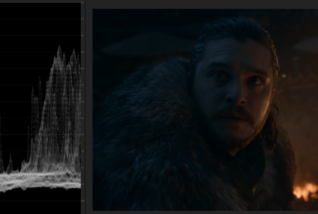
Game of Thrones – The Long Night #4 (2019)
This beautiful shot is low in light levels on Jon Snow’s face but the addition of blue moon light and orange light from the fire provide further definition and isolation of the character in the frame. The left side of Jon’s face is showing almost 80 IRE.
When composing, lighting and color grading “dark” shots, one can use COLOR, CONTRAST and/or DEPTH STAGING to amplify the imagery and help show more definition even with low light levels. When these 3 approaches are used at once, the shots have a much better chance of helping the viewers understand the geography and context of the shot.
Game of Thrones – The Long Night #5 (2019)
Ser Jorah’s face is only at 25 IRE in the foreground, but the depth of layers and fire behind help him pop as the center of focus even in a predominantly dark shot.
Game of Thrones (2019) – The Long Night
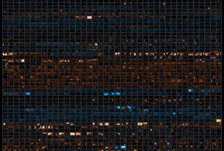
Vashi Frames – All 2005 individual shots from the episode
VIDEO: not a re-grade. Just a +4 exposure boost experiment.
Solo: A Star Wars Story (2018)
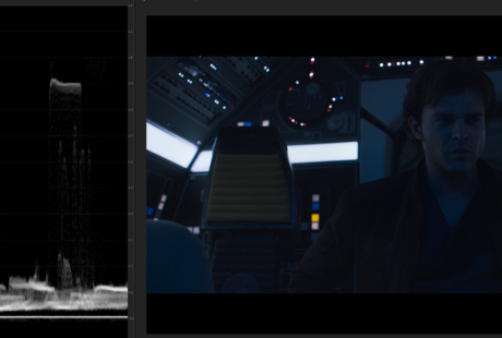
Young Han Solo’s face is at 25 IRE with an edge highlight of 60 IRE to help him stand out along with his careful framing between the cockpit lights.
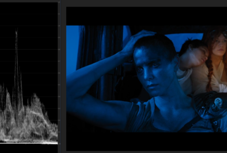
For another option on the possibilities of nighttime footage, here’s the ‘day for night’ approach used in Mad Max: Fury Road. Charlize’s face is showing 43 IRE.
THE DARK PAST
DP Gordon Willis was known as “The Prince of Darkness” for his penchant of dark cinematography. He fully embraced: color / contrast / deep staging to fully ensure clarity of imagery. I’ve picked three of his films as examples of this approach. Three examples that I love for their artistry. Also, consider that Willis did not have a color grade option and everything was timed photochemically.
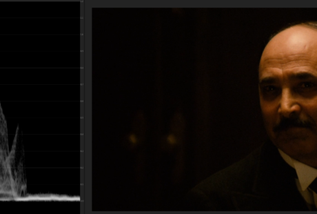
The Godfather (1972)
The opening shot (and many more shots) of Francis Ford Coppola’s masterpiece was called too dark to release by Paramount. With stark contrasty, overhead lighting, Amerigo Bonasera’s head registers 78 IRE, which is in fact very bright.
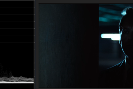
All the President’s Men (1976)
Deepthroat in the parking garage is a mysterious source of information who remains shrouded in darkness. The edge light creates contrast on the side of his face with 80 IRE. Added is a tiny eye light so he is visible, defined and stands out from the background fluorescent lights with depth staging.
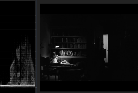
Manhattan (1979)
With only three (?) well-positioned lights, Gordon Willis created just enough light in this massive wide shot to illuminate the important areas and show the geography of the apartment. Woody is a recognizable silhouette on the stairs and Mariel Hemingway inhabits the brightest area (65 IRE) where the scene will eventually play out. Everything else is in complete darkness.
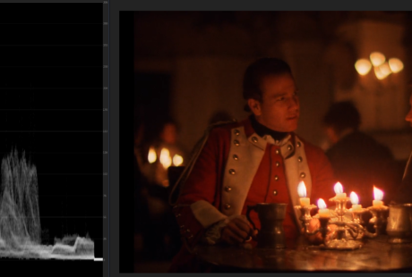
Barry Lyndon (1975)
DP John Alcott used only candlelight or natural light to illuminate the interiors of Stanley Kubrick’s film. Ryan O’Neal’s face reads 55 IRE.
WRAP UP
In a perfect world / cinema / home theater, every shot will sing out and the story will flow forward like an unstoppable tsunami of visuals and emotions. Unfortunately, that’s not the case. Slow streaming speeds, additional compression, old projector bulbs and uncalibrated TVs can make the viewing experience challenging or even exasperating.
Hopefully, a solution will arise in the future that creates a level playing field for all content creators and storytellers. What’s the point of hundreds of artists working thousands of hours to get as close to perfection as possible…only to have the final product delivered in a subpar method. We can do better…
I will leave you with the true story of Oscar-winning DP Andrew Lesnie on the set of Return of the King. Sean Astin (Samwise) asked Andrew about the light source of a scene in Cirith Ungol. Sean asked, “Where’s the light coming from?” Andrew responded, “The same place as the music.”
Also: The Dark Cinematography of David Fincher
https://vashivisuals.com/david-fincher-into-the-darkness-2/
Until next time…

There are 6 comments
Hello Vashi,
An excellent post. It’s interesting how dark cinematography is playing out in the real world. In a movie theatre, the ambient light is controlled and we can more easily see a character sitting at 20 IRE with a bit of an edge. Take that same movie and view it on your phone while riding in a taxi cab and you have a totally different viewing experience. The whole screen may look black. That’s the biggest challenge we face now as filmmakers – trying to anticipate where our work will be seen. Do we need vastly different grades for theatrical, TV, Netflix, YouTube, Instagram etc ? Yes, it would seem so. Like not just output adjustments but actual grades. Do we have time for this? I don’t.
Nice post Vashi. I enjoyed seeing measurements of the GoT content alongside the other films known for dark cinematography.
My home theater is not the latest/greatest but seeing the detail in the GoT episode was difficult from my full HD projector on a 110in screen in a darkened room. I’m curious if the experience for people with HDR displays was better.
Where did you get the copy of “The Long Night” you used? To your very point about that affecting the visuals…my viewing experience was not that dark on HBO Now, but rather full of banding and chroma noise in all the levels of black. I’m not aware of a truly high quality output HBO has until its on Blu-ray or at least on iTunes, this affecting the amount of info etc in the files.
I’m not in the “too dark” crowd, I mean was dark but found it artistic.
But must say that the article doesn’t seem to answer the crowd’s complaints. Reporting on the values as per the beginning, actually seems like telling them they are right, because faces are less lit than what is customary.
It feels there’s no real conclusion, except telling people their TVs are not calibrated or shit.
I must say episodes like this (other recent dark stuff I watched was for eg Iron Fist) makes me want to buy a newer tv with more contrast.
Love that response: “The same place as the music.”
Golden!
Great stuff, thanks so much for posting such in depth material.I try and soak it all in.You’re the greatest!