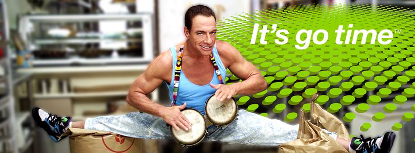
Go Daddy has long been known for its sexy commercials with big breasts and racy double-entendres. Their latest commercial has a baker kneading dough, Jean Claude Van Damme and a catch phrase. It is simple, smart, funny and demonstrates that an effective commercial does not need a million dollar budget. This commercial could have shot on an iPhone. I mean that as a compliment to the production. Therein lies the beauty…it’s the writing, set design, editing and planning that makes it so amazing. Ad agency Deutsch has just launched this new spot that redefines Go Daddy.
Go Daddy has gone back to basics and told a funny, visually compelling story that delivers their specific message in the most bare bones way. Every filmmaker and storyteller can learn some lessons from this perfect 30-second spot. I would like to break down the specific elements that make it work so well. As an editor of numerous national commercials and feature films…I want to share with you the secrets of what makes this ad so effective.
Instead of rambling let me get right to my point and list the ways that Go Daddy nailed this commercial:
1. They cast a familiar movie star (of another era) and used his specific talents in an unusual way. Jean Claude Van Damme is known worldwide and has maintained his signature ripped look…and still does the splits like a badass. Of his brethren…he’s not face-tucked and veiny like Sylvester Stallone, lizard-faced like Arnold Schwarzenegger or doughy like Steven Seagal. He can play comedy in a natural, effortless way and when he delivers his line in a raspy accent…it kills. “It’s go time” is Go Daddy’s call-to-arms for small business and the underdog…and in the same breath…it humorously distances themselves from the tits and ass campaigns it has run in the past.
2. By going against the grain of widescreen cinematography, super-saturated colors, fast editing, explosions, aliens and expensive camera moves…Go Daddy delivers a commercial that doesn’t look like other commercials…and thus stands out. There are no: Steadicam, dolly, slider, crane, jib, helicopter, Movi or handheld shots in this commercial. It is said you must move the camera to make an ad look expensive, cinematic and to justify the budget. This is the antithesis of that. This commercial has 18 shots and ALL OF THEM ARE ON A TRIPOD. LOCKED OFF. STATIC. One shot pans a couple feet to reveal Jean Claude HANGING UPSIDE DOWN FROM THE CEILING for no particular reason…and it gets a laugh. He is…Jean Claude Bat Manne (sorry loyal readers…had to do it). By planning ahead with storyboards, they specifically chose 18 shots (ONLY 12 different camera angles) that comprise the entirety of the commercial.
3. Comedy is often said to be the hardest kind of filmmaking to do well. Something is either funny or it’s not. You physically cannot make someone laugh at an unfunny joke. I learned all of my comedy editing working with director David Zucker (Airplane!, Scary Movie) cutting his last feature film…and when the audience in Plano, Texas didn’t laugh at the preview screening of the film…we went back to Reel 1, Scene 1 and started again. Crafting the laugh starts at writing, then performance, then editing. The subtle double-takes and eye-brow lifts in this commercial convey the comedy. It’s the little things that connect with the audience and come across as a big laugh…especially when their is NO DIALOG until the catch phrase at the end. This is not easy…and Van Damme and The Baker deliver. This is the essence of Pure Cinema…to be able to tell the story with no dialog.
4. Set design and wardrobe are often low on the list of things that are perceived to be important…and this is a travesty.
The baker’s shop is pristine, white with muted colors and lit with soft even lighting. This is a low contrast commercial that looks like the RAW camera data before it is graded. It looks undone…but real. The only color that pops through is Van Damme’s blue tank-top and the rainbow strap of his bongos…and the RAINBOW COLORED FLAMES shooting out of the pan flute. Zamfir would be proud! By using a desaturated, clean color palette…any distinctive color will be emphasized and that is why Van Damme was garbed in the his blue tank-top outfit. It allows him to reveal why the “The Muscles from Brussels” at 52, is still capable of doing splits 10 feet above the ground while shaking maracas. I bet most of us would blow a groin trying this maneuver.5. Sound and music is said to make up 50% of the viewing experience. With only one line of dialog in this commercial…I would say this gets bumped up to 75% in this case. It’s also done almost invisibly.The sonic palette here is built up over the course of the ad. It starts with silence and the sound of the baker dropping dough. The off-camera sonic impetus that makes him look up is the bongo playing. This forces the viewer to ask…”What the fuck he is looking at?”. Answer…Jean Claude Van Damme doing the splits on flour bags while playing bongos. WTF! You have to laugh. Mission accomplished. The reveal has just set the tone for the spot. Next is the shaking maracas which are layered OVER the bongos. This lets the director cut to Van Damme lodged up against the ceiling playing said maracas. BUT THE BONGOS ARE STILL PLAYING! This is how audio is used as an additive process that defies logic yet works without argument. That is filmmaking magic. Lastly…Jean Claude playing the flaming pan flute is brought into the mix and we now have a full score playing in real-time…by one martial artist. Clean, simple and invisible. Kudos to Deutsch and the Go Daddy Team!
My take-away and main point for all of this is simple:To make an effective commercial/video/film…you don’t need millions of dollars. You need creativity, proper planning and the tools available to you RIGHT NOW. It’s easy to stall and tell yourself you need the hot new camera or gadget to allow your brilliance to be unleashed. The greatest novels and scripts were written pen/pencil/typewriter to paper. It’s not the camera or budget that makes something amazing. It’s all inside you already and it’s waiting to be released into the wild. I have no idea what the budget of this Go Daddy commercial was…but I know if any of us had come up with the idea…and knew Jean Claude Van Damme…we could have delivered something comparable. The “Idea is King” and we all carry an HD camera in our pocket. Stop making excuses and shoot the shit out of any idea you believe in.
As an afterthought…I wanted to “Hollywood” this commercial and see what it look like with an aggressive color grade and a widescreen aspect ratio. I saturated the colors, added a Kodak film stock and grain look and cropped the image to a cinematic 2.35 aspect ratio to emulate what might be perceived as a “big budget” look.
I much prefer the natural and more authentic look of the final spot as it aired. I feel it delivers the goods by capturing the honest look of a baker and his kitchen in the real world as opposed to the exaggerated garishness of a “Hollywood” look. A baker may not be glamorous but he sure as shit is a hard-working individual that puts in sick hours every day. That’s what the message is. Work hard and smart to get rewarded.
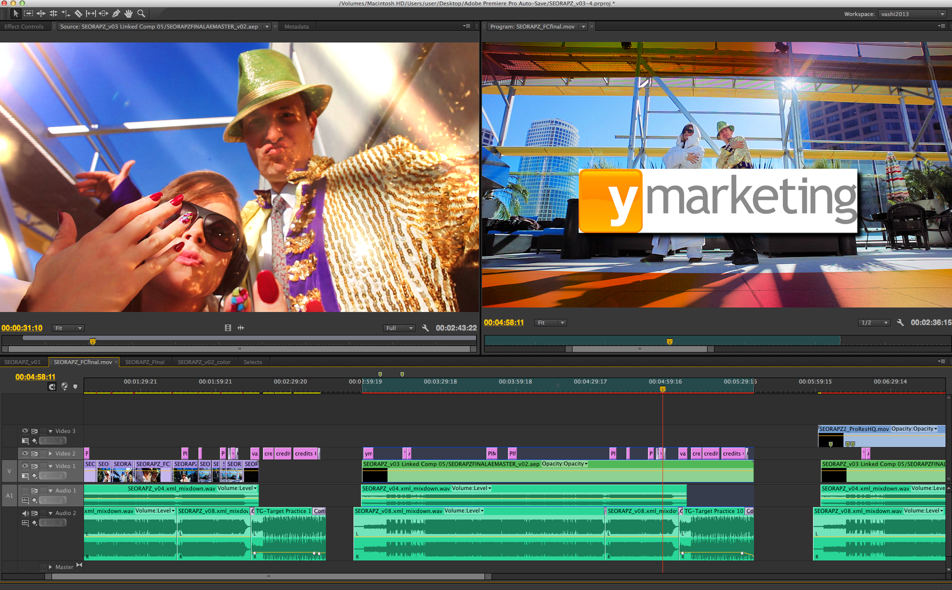
Finally, I found Jean Claude Van Damme’s bongo to be quite hypnotic and mesmerizing so I decided to remix the commercial into my own 30-second spot that focuses on that aspect. REMIXES are a creative outlet I find quite healthy. Feel that shit! Share that shit!
Until next time…


![GoDaddy Presents - The Baker featuring Jean-Claude Van Damme [720p].mp4.Still007](https://vashivisuals.com/wp-content/uploads/2013/09/GoDaddy-Presents-The-Baker-featuring-Jean-Claude-Van-Damme-720p.mp4.Still007.jpg)
![GoDaddy Presents - The Baker featuring Jean-Claude Van Damme [720p].mp4.Still016](https://vashivisuals.com/wp-content/uploads/2013/09/GoDaddy-Presents-The-Baker-featuring-Jean-Claude-Van-Damme-720p.mp4.Still016.jpg)
![GoDaddy Presents - The Baker featuring Jean-Claude Van Damme [720p].mp4.Still012](https://vashivisuals.com/wp-content/uploads/2013/09/GoDaddy-Presents-The-Baker-featuring-Jean-Claude-Van-Damme-720p.mp4.Still012.jpg)
![GoDaddy Presents - The Baker featuring Jean-Claude Van Damme [720p].mp4.Still013](https://vashivisuals.com/wp-content/uploads/2013/09/GoDaddy-Presents-The-Baker-featuring-Jean-Claude-Van-Damme-720p.mp4.Still013.jpg)
![GoDaddy Presents - The Baker featuring Jean-Claude Van Damme [720p].mp4.Still015](https://vashivisuals.com/wp-content/uploads/2013/09/GoDaddy-Presents-The-Baker-featuring-Jean-Claude-Van-Damme-720p.mp4.Still015.jpg)
![GoDaddy Presents - The Baker featuring Jean-Claude Van Damme [720p].mp4.Still019](https://vashivisuals.com/wp-content/uploads/2013/09/GoDaddy-Presents-The-Baker-featuring-Jean-Claude-Van-Damme-720p.mp4.Still019.jpg)


There are 6 comments
Great article. I’m finding a number of blogs talking about the power of the story vs. the power of your camera. It’s very true that so many people starting out in the filmmaking process (myself included) are in the mindset that we need the newest, most competitive camera to tell a solid story, when in fact we just need to shoot. It’s similar to the Malcolm Gladwell theory of 10,000 hours of practice, just shoot and make mistakes and learn. It’s easy to get lost in the sea of gadgetry. Very exciting to see what Deutsch and Go Daddy did.
I think the film grain effect makes it look like poo to be honest but I don’t mind the 2:35 crop or color grade. The bongos remix was awkwardly funny.
Great blog post Vashi! Love your breakdown of this commercial and your positive words have given me that kick in the ass to just go out there and SHOOT. Thank you.
Thanks so much for the kind words Andy. My sincere pleasure and I’m glad you enjoyed the post. We all need to remember to just DO and not procrastinate…myself included!
[…] Go Daddy reinvents the smart and funny commercial […]
[…] on vashivisuals.com Like this:Like Loading… Share a comment: Your email address will not be published. […]