In more and more prestige TV series, an odd aspect ratio is popping up on some of the most popular and well-reviewed shows.
The 2.00:1 aspect ratio has stealthily wormed its way into our viewing experiences without any of us knowing it.
Here’s how and why it was created.
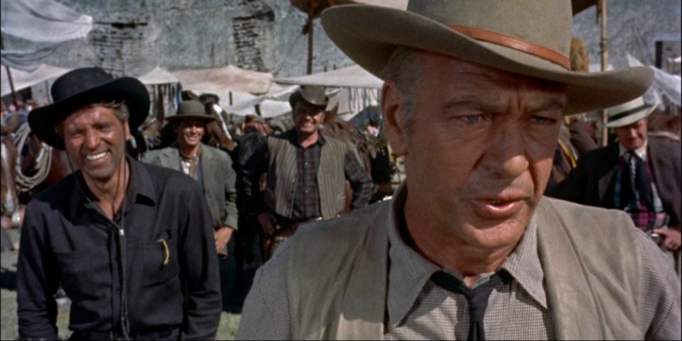
Technically, the first use of the 2.00:1 aspect ratio was the 65mm Fox Grandeur version of THE BIG TRAIL (1930). The next was the RKO SUPERSCOPE format for the 1954 production of VERA CRUZ.
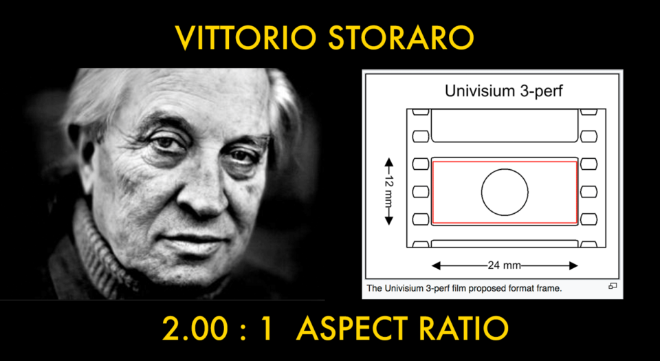
In 1998, DP Vittorio Storaro proposed UNIVISIUM as a new film format with an aspect ratio of 2 to 1. He felt that the rise of electronic screens (TV, computer, portable…) needed a new format that could enhance and future-proof the visuals across all viewing platforms and situations. Vittorio has shot his last 10 feature films in the 2:1 ratio including his latest film Cafe Society for Woody Allen. Vittorio has even reframed several of his most famous films (Apocalypse Now, Reds, The Last Emperor) and released them in new DVD and Blu Ray editions.
In 2013 the 2.00:1 ratio also known as the 2:1 or even 18:9 aspect ratio became a very common format on TV.
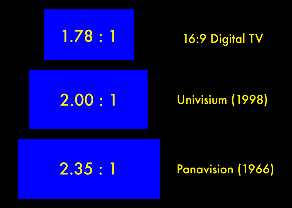
It falls right in-between the common 16:9 and classic widescreen aspect ratio.
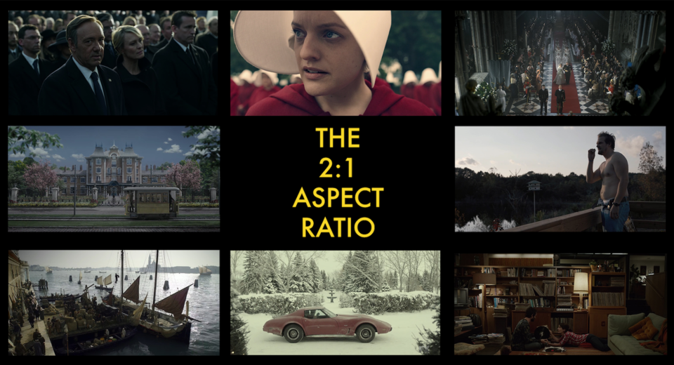
Here’s the recent chronological history of 8 popular TV shows that use this aspect ratio:
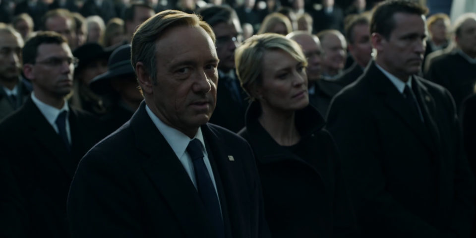
House of Cards (2013)
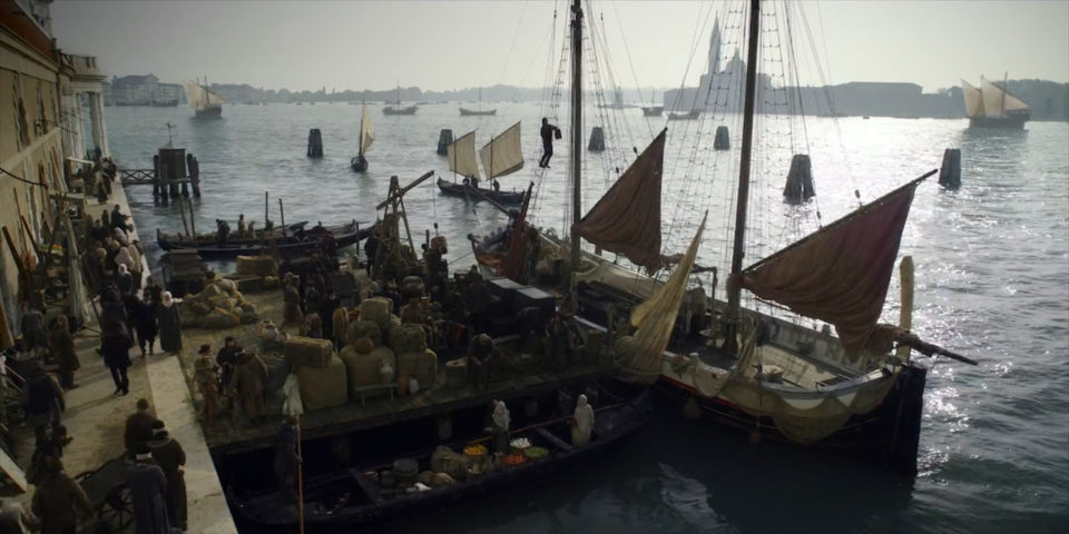
Marco Polo (2014)
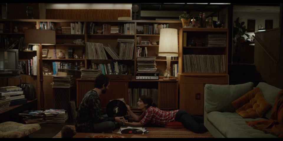
Transparent (2014)
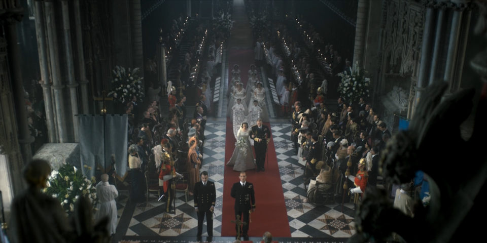
The Crown (2016)
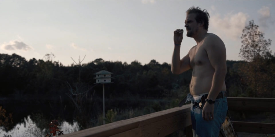
Stranger Things (2016)
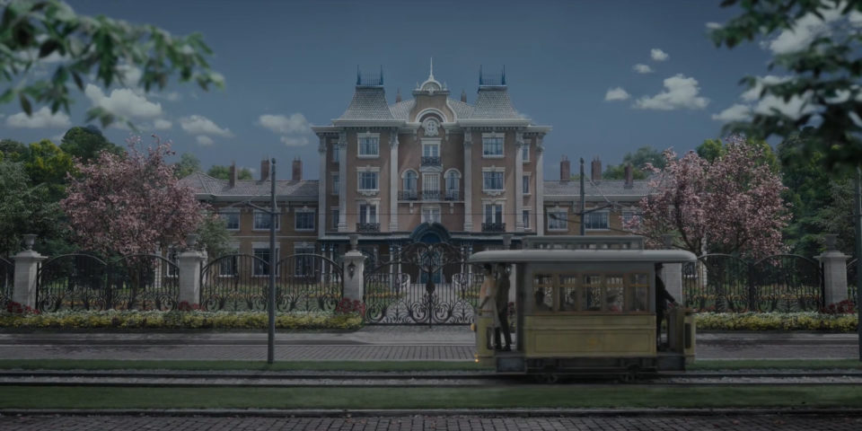
A Series of Unfortunate Events (2017)
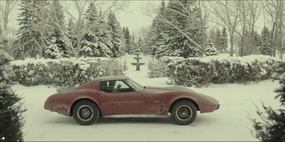
Fargo (Season 3 – 2017)
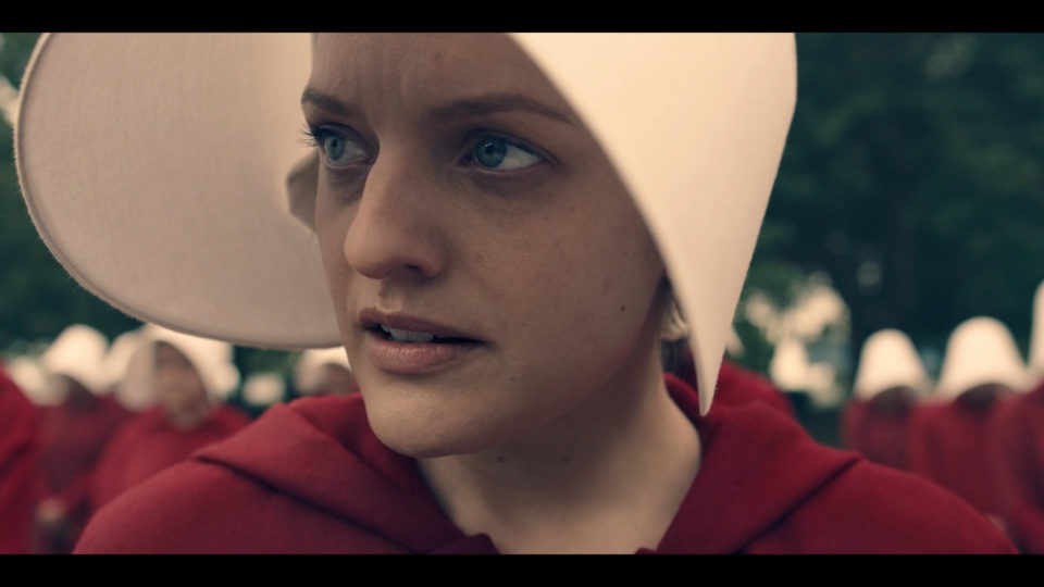
The Handmaid’s Tale (2017)
Ozark (2017)
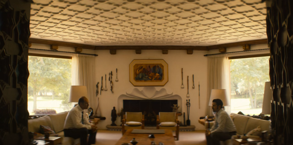
NARCOS: MEXICO (2018)
There has been a resurgence of the 2:1 aspect ratio in the feature film world as well.
It turns out that this aspect ratio is a logical middle ground between the 2.35 and 1.78 ratios.
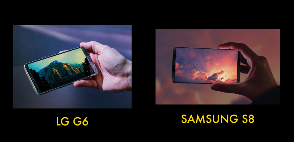
Even the new Samsung S8 and the LG G6 smartphones have embraced the 2:1 aspect ratio in the consumer device market.
Some of the most recent feature films also utilize this aspect ratio including:
JURASSIC WORLD
CAFE SOCIETY
THE GIRL WITH THE ALL THE GIFTS
20TH CENTURY WOMEN
THE BOOK OF HENRY
In one of my most popular posts…I documented every aspect ratio in the history of film.
With so many options for the framing of TV and feature films and no industry standard anymore…the visual parameters belongs to the content creator and we can choose our own frame.
I will be adding a video to this page to dig deeper into the history of the 2:1 aspect ratio so check back soon…
Until next time…


There are 2 comments
I don’t think you can talk about the ascendency of 2:1 without talking about the decline of 1.85:1 :). 1.85 is just plain awkward on a 1.78:1/16×9 screen, where the vast majority of content is consumed. That little sliver of letterboxing just doesn’t look good. Do we all agree on that (interested to hear other viewpoints)?
Obviously, for content _originated_ in that format the original AR is the only AR (esp. when projected). But for new content (new films, streaming content), can we say that 2:1 is the new 1.85? It’s wide enough to look “grander” than normal – close to Todd-AO (and cropping it to simple 16×9 would do some amount of damage) – but tall enough not to be confused with ‘scope. It _is_ kind of perfect when you think about it. Was Vittorio right all along?
1.85 was an _Academy_ AR, even if the broad strokes were inherited from VistaVision. We’re waaaay beyond Academy aperture now.
So, I’m a fan of 2:1 – on the basis of Chef’s Table S1:E3 alone.
Just been watching Stranger Things series 2 on Netflix and noticed ‘wierd’ letterboxing which discover is 2:1. I don’t see the point, it just seems like an unecessary compramise. with the size of screens and increasing resolutions these days I personally have no problem with more ‘widescreen’ ARs like 2.35:1 or even 2.39:1 what I have a harder problem with is 16:9 or close to, just looks like TV. 🙂 Or worse cropped and zoomed 2.35 stuff we get streamed by the likes of Netflix and Amazon which is why I still prefer to buy DVDs and Blurays of movies to watch in their ‘original’ concieved format. Cropping the directors vision and zooming to fill the vertical is crass.